
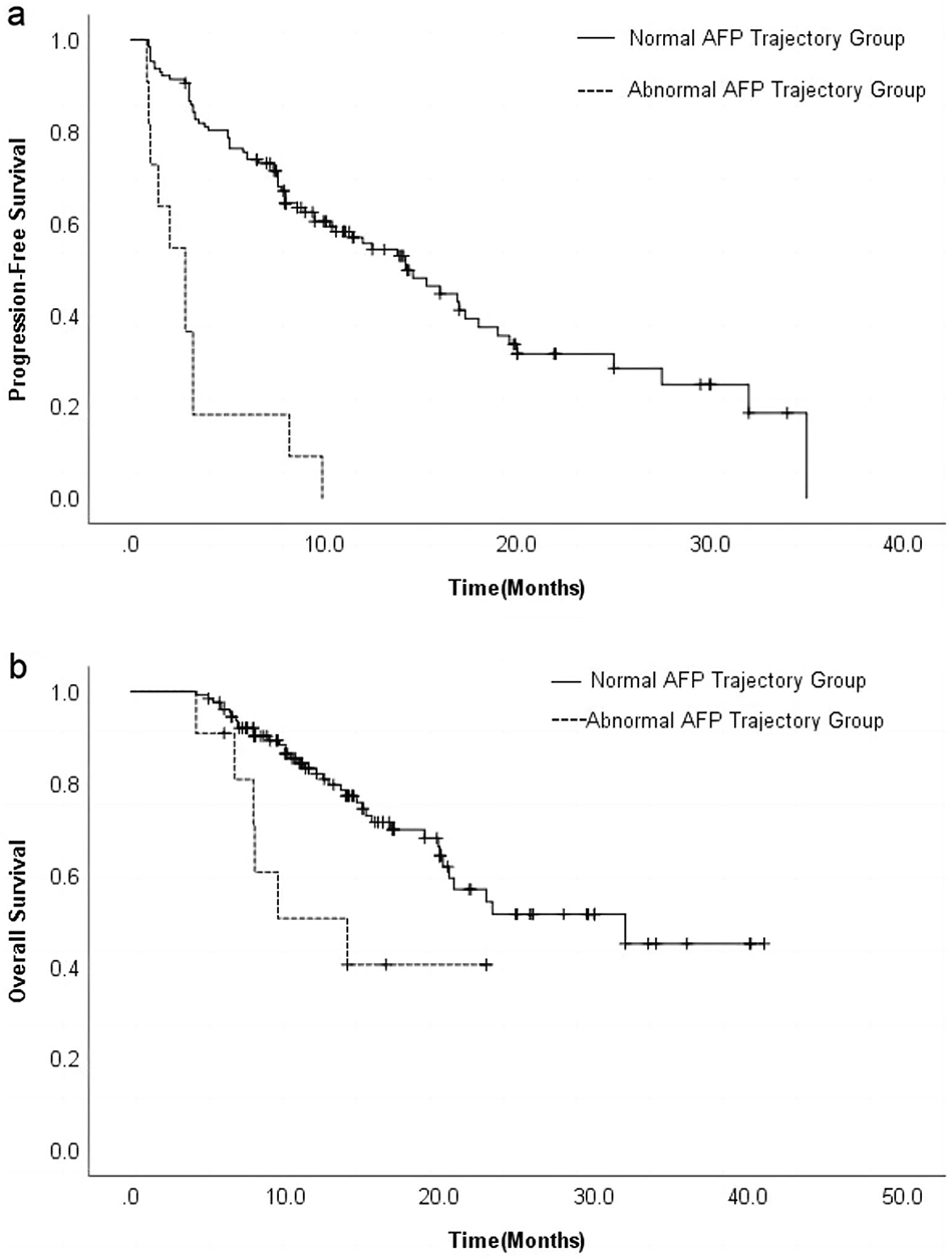
Remember me


In the differential analysis of PE, we identified 52 differentially expressed genes, among which 5 were downregulated and 47 were upregulated (Fig. 1A). Before analyzing the PE score in endometrial carcinoma, we integrated and quality-controlled the single-cell data, retaining 31,442 cells for downstream analysis following stringent methodological quality control standards (Fig. 1B). Based on the ElbowPlot results, we selected the top 20 principal components for dimensionality reduction and clustering. With a resolution set to 0.02, we identified seven clusters (0–6) (Fig. 1C). After batch effect removal, the cells from different samples were evenly distributed and ready for further analysis (Fig. 1D). According to singleR and previous literature, the seven clusters were annotated into six cell types, including endothelial cells (PLVAP, PECAM1, SELE, CLDN5), epithelial cells (WFDC2, KRT18, KRT8, EPCAM), fibroblasts (PCOLCE, LUM, DCN, COL1A1), T cells (PTPRC, CCL5, CD7, CD2), macrophages (TYROBP, APOC1, C1QB, C1QA), and mast cells (TPSAB1, CPA3, TPSB2, GATA2) (Fig. 1E, F). To assess the differences in PE scores among cell types, we calculated scores using multiple algorithms and defined the median of four scoring methods as the PE score. The results showed that macrophages had significantly higher PE scores than other cell types (Fig. 1G).
Fig. 1
Differential gene expression and clustering analysis of PE in endometrial cancer (EC). A Volcano plot showing the differentially expressed genes between PE and control samples. Genes with logFC > 2 or logFC < −2 and an adjusted p-value < 0.05 were considered significant. Highlighted are the 5 downregulated and 47 upregulated genes. B Uniform Manifold Approximation and Projection (UMAP) visualization of single-cell RNA sequencing data after integration and quality control, showing the distribution of cells from different EC samples. C UMAP plot showing clustering of cells into seven distinct clusters (0–6) based on dimensionality reduction and resolution 0.02. D UMAP plots displaying the distribution of cells before and after batch effect correction using Harmony, showing that cells from different samples are evenly distributed. E UMAP plot showing the annotation of the seven clusters into six cell types based on known markers: endothelial cells, epithelial cells, fibroblasts, T cells, macrophages, and mast cells. F Dot plot representing the expression levels of marker genes across the different cell types. G Dot plot showing the PE scores across different cell types calculated using four scoring methods, with macrophages displaying significantly higher scores compared to other cell types
3.2 PE score-related genes in uterine corpus endometrial carcinoma (UCEC)Among the 302 genes associated with PE scores, 106 genes exhibited significant differential expression in endometrial carcinoma. Univariate Cox analysis of these 106 genes identified 14 genes associated with endometrial carcinoma prognosis (Fig. 2A). To illustrate the complex relationship between PE score-related genes and endometrial carcinoma prognosis, we constructed a network diagram (Fig. 2B). The genomic locations of these 30 genes are displayed in Fig. 2C. Further analysis revealed widespread CNVs among these genes, with FSTL3 and LIMD2 showing deletions and TIMP2 showing amplification (Fig. 2D). Investigation of somatic mutation frequencies in these 14 genes in cervical cancer revealed that COL6A3 had the highest mutation rate (up to 72%), while the other genes had lower mutation frequencies (Fig. 2E). Comparative analysis showed that most PE score-related genes were significantly upregulated in endometrial carcinoma tissue compared to normal tissue (Fig. 2F).
Fig. 2
PE score-related genes in uterine corpus endometrial carcinoma (UCEC). A Forest plot of univariate Cox regression analysis showing hazard ratios and p-values for the 14 genes associated with EC prognosis. B Network diagram illustrating the relationship between PE-related genes and their association with risk factors (red) and favorable factors (green) in endometrial carcinoma prognosis. C Circos plot displaying the chromosomal locations of the 30 PE score-related genes. D Copy number variation (CNV) frequency analysis of the 14 genes, showing gains (red) and losses (green) across endometrial carcinoma samples. E Waterfall plot illustrating the somatic mutation frequencies of the 14 PE-related genes in cervical cancer patients, with COL6A3 having the highest mutation rate (72%). F Boxplot comparing the expression levels of the 14 PE score-related genes between normal and tumor tissues, indicating significantly higher expression in endometrial carcinoma
3.3 Clustering of UCEC patients into C1 and C2 groupsUsing consensus clustering analysis, we divided 522 endometrial carcinoma patients into two groups, C1 and C2 (Fig. 3A–C). Figure 3D illustrates the differential expression of the 14 genes between the C1 and C2 groups. Kaplan–Meier analysis revealed a significant difference in survival rates between the C1 and C2 groups (P < 0.001, Fig. 3E), with C2 patients having a better prognosis. Immune cell infiltration analysis showed that C2 had higher infiltration of various immune cells, including regulatory T cells, CD8 T cells, activated NK cells, and dendritic cells (Fig. 3F).
Fig. 3
Consensus clustering analysis and characterization of endometrial carcinoma subtypes. A Consensus clustering matrix of 522 endometrial carcinoma patients, divided into two clusters (C1 and C2) based on gene expression profiles, with k = 2 as the optimal number of clusters. B Delta area plot showing the relative change in the area under the cumulative distribution function (CDF) curve, supporting k = 2 as the optimal cluster number. C CDF plot illustrating consensus distribution for different values of k, with k = 2 providing a clear separation. D Differential expression analysis of 14 genes between C1 and C2 groups. E Kaplan–Meier survival analysis showing that patients in the C2 group have a significantly better prognosis than those in the C1 group (p < 0.001). F Immune cell infiltration analysis demonstrating that the C2 cluster has higher infiltration of immune cells. G Tumor microenvironment (TME) analysis revealing that C2 has higher stromal, immune, and ESTIMATE scores, indicating a more favorable immune microenvironment. H Pathway enrichment analysis showing that C2 subtype is negatively associated with several signaling pathways
Regarding the differences in the tumor microenvironment (TME) between the two groups, C2 exhibited higher immune and mechanism scores (Fig. 3G). Finally, enrichment analysis revealed that the C2 subtype was negatively correlated with signaling pathways such as the WNT and Notch pathways (Fig. 3H).
3.4 Construction of a risk model using 14 prognostic genesGiven the significant impact of the 14 PE-related prognostic genes on endometrial carcinoma prognosis, we performed LASSO regression analysis and subsequently utilized multivariate Cox regression to construct a risk model based on the remaining core risk genes (Fig. 4A, B). Ultimately, five genes—FSTL3, PRSS23, IGFBP4, MYDGF, and TSC22D3—were selected as core risk genes for the final risk model (Fig. 4C). In both the TCGA cohort and the training and validation sets, we observed significant differences in overall survival between the high- and low-risk groups stratified by risk score. Patients in the low-risk group consistently showed better overall survival rates. Additionally, the risk model effectively predicted 1-, 3-, and 5-year overall survival and represented characteristic information for certain patients (Fig. 4D-I).
Fig. 4
Construction of a risk model using 14 prognostic genes. A LASSO regression plot showing the coefficient paths for each gene in relation to log lambda. B Partial likelihood deviance of the LASSO regression model with tenfold cross-validation, identifying the optimal lambda value. C Coefficients of the five core prognostic genes selected for the final risk model (FSTL3, PRSS23, IGFBP4, MYDGF, TSC22D3). D–F Kaplan–Meier survival curves comparing overall survival between high-risk and low-risk groups in the training, validation, and TCGA cohorts, showing significantly better survival in the low-risk group (p < 0.001). G–I ROC curves evaluating the predictive accuracy of the risk model for 1-, 3-, and 5-year overall survival in the training, validation, and TCGA cohorts, demonstrating robust performance with AUC values above 0.7
3.5 Independent prognostic value of risk score in endometrial carcinomaTo investigate the independent prognostic role of the risk score alongside other clinical features such as age, grade, and stage, we performed univariate and multivariate Cox regression analyses. These analyses demonstrated that the risk score independently predicted overall survival in endometrial carcinoma patients (Fig. 5A, B). Using TCGA data, we constructed a nomogram to predict 1-, 3-, and 5-year OS, incorporating the risk score, age, grade, and stage as predictive parameters (Fig. 5C). The calibration curve, concordance index (C-index), and decision curve analysis (ECA) indicated good consistency between the predicted and actual outcomes (Fig. 5D–F). The heatmap revealed clear clustering differences between the risk groups in terms of stage, immune score, and stromal score (Fig. 5G). When analyzing the differences in risk scores between PE-related clusters, we found that the C2 subgroup had lower risk scores (Fig. 5H). Furthermore, a Sankey diagram showed that the C2 group, characterized by lower risk scores, correlated with more favorable survival outcomes (Fig. 5I).
Fig. 5
Independent prognostic value of risk score in endometrial carcinoma. A Univariate Cox regression analysis showing hazard ratios and p-values for clinical features (age, grade, stage, and risk score) in predicting overall survival. B Multivariate Cox regression analysis showing that the risk score independently predicts overall survival, alongside clinical features. C Nomogram predicting 1-, 3-, and 5-year overall survival based on risk score, age, grade, and stage in EC patients. D Calibration curves comparing observed overall survival with nomogram-predicted survival at 1, 3, and 5 years, indicating good predictive accuracy. E Concordance index (C-index) comparing risk score, age, grade, and stage over time, showing the highest concordance for the risk score. F Decision curve analysis (ECA) for the risk score and clinical features, showing the net benefit of the risk score in predicting overall survival. G Heatmap displaying clustering differences in risk score, age, grade, stage, immune score, and stromal score between high- and low-risk groups. H Violin plot showing significantly lower risk scores in the C2 cluster compared to the C1 cluster. I Sankey diagram illustrating the association between clusters, risk groups, and survival outcomes, showing that the C2 cluster is associated with lower risk scores and better survival
3.6 Immune characteristics of low-risk groupIn the low-risk group, most genes from the HIL family exhibited higher expression levels (Fig. 6A). Using multiple methods, including ssGSEA, we performed enrichment and functional analysis of immune cells and their functions. The results indicated that nearly all immune functions, except for the type II IFN response, were significantly enriched in the low-risk group (Fig. 6B). Figure 6C, D show that the infiltration of almost all immune cells was more pronounced in the low-risk group compared to the high-risk group. Additionally, immune scores indicated that the low-risk group had higher immune and stromal component scores (Fig. 6E). Finally, we compared the differences in immune types between risk groups and found a significant variation in immune types between the two groups (Fig. 6F).
Fig. 6
Immune characteristics of the low-risk group. A Boxplot comparing the expression levels of HLA genes between high-risk and low-risk groups, showing higher expression in the low-risk group. B Boxplot comparing immune function scores between high-risk and low-risk groups, showing significant enrichment of immune functions (except for type II IFN response) in the low-risk group. C Boxplot comparing immune cell infiltration scores between high-risk and low-risk groups, showing higher infiltration of almost all immune cells in the low-risk group. D Violin plot comparing immune component scores (StromalScore, ImmuneScore, and ESTIMATEScore) between high-risk and low-risk groups, indicating higher scores in the low-risk group. E Heatmap displaying immune-related pathway enrichment analysis, comparing differences between high- and low-risk groups in the TCGA cohort. F Heatmap displaying the distribution of immune subtypes between the high-risk and low-risk groups, showing a significant difference in immune subtype composition between the two groups within the TCGA cohort
3.7 Immune therapy as a treatment option for advanced malignanciesImmunotherapy is becoming a treatment option for patients with advanced malignancies. Our analysis of the TIDE results revealed that TIDE and Exclusion scores were lower in low-risk patients. However, we also found that the immune therapy response rates between high- and low-risk patients were similar (Fig. 7A, B). Previous studies suggest that TIDE scores are inversely correlated with the efficacy of immunotherapy in cancer patients. Given the potential of immune checkpoint inhibitors (ICIs) to block CTLA4/PD-1 interactions and treat certain tumors, we used IPS scores based on IFNG expression levels to evaluate the potential for treatment. Notably, low-risk patients exhibited higher IPS scores across multiple assessments (Fig. 7C). Microsatellite instability (MSI) is widely used to predict patient prognosis and immunotherapy response. In our study, we compared the MSI status of patients with different risk types and found that MSI-H patients were more common in the low-risk group, which further explained their better prognosis (Fig. 7D). Figure 7E highlights significant differences in the expression of checkpoint genes between the two groups, with higher expression observed in the low-risk group. This includes several well-known immunotherapy targets, such as CD274 (programmed death-ligand 1, PD-L1) and CTLA4.
Fig. 7
Immune therapy as a treatment option for advanced malignancies. A Violin plots comparing TIDE, IFNG, dysfunction, and exclusion scores between high- and low-risk groups, showing lower scores in the low-risk group. B Bar plot showing the proportion of responders and non-responders in the high- and low-risk groups. Boxplot comparing risk scores between immune therapy responders and non-responders. C Violin plots comparing IPS scores (based on CTLA4 and PD-1 status) between high- and low-risk groups, showing significantly higher scores in the low-risk group, indicating a greater potential for immune checkpoint inhibitor therapy response. D Bar plot showing the proportion of MSI-H, MSS, and MSI-L patients in the high- and low-risk groups. Boxplot comparing risk scores between patients with different MSI statuses, showing that MSI-H patients are more common in the low-risk group. E Boxplot comparing the expression levels of immune checkpoint-related genes between high- and low-risk groups, with higher expression observed in the low-risk group, including key immunotherapy targets such as PD-L1 and CTLA4
3.8 Tumor mutation burden and prognosisTumor mutations play a critical role in influencing patient prognosis. As shown in Fig. 8A and B, the mutation frequency between high- and low-risk groups was similar. Additionally, Fig. 8C demonstrates that patients with high TMB had better survival rates compared to those with low TMB. Figure 8D indicates that patients in the high-risk group with low TMB had the worst prognosis.
Fig. 8
Tumor mutation burden (TMB) and prognosis. A Waterfall plot showing the mutation frequency of common cancer-related genes in high-risk patients, with PTEN, PIK3CA, and ARID1A among the most frequently mutated genes. B Waterfall plot showing mutation frequency in low-risk patients, with a similar mutation profile to high-risk patients. C Kaplan–Meier survival curve comparing overall survival between patients with high and low TMB, showing significantly better survival in the high-TMB group (p < 0.001). D Kaplan–Meier survival curve comparing overall survival between high-risk and low-risk groups, stratified by TMB levels, showing that high-risk patients with low TMB have the worst prognosis (p < 0.001)
3.9 Comparative analysis of treatment outcomes between risk groupsWe compared the treatment outcomes between patients in different risk groups. In the IMvigor-210 cohort, we evaluated the restricted mean survival (RMS) at 6 and 12 months to account for the delayed clinical effects of immunotherapy. We also assessed differences in long-term survival after 3 months of treatment (P < 0.05; Fig. 9A, B). The results indicated that low-risk patients had better prognoses, suggesting a greater benefit from immunotherapy. Additionally, the distribution of risk scores across patients with different treatment responses showed that the responders (complete response [CR]/partial response [PR]) had significantly lower risk scores compared to non-responders (progressive disease [PD]/stable disease [SD]) (P = 0.021, Fig. 9C). Consistently, in the GSE78220 (p = 0.027, Fig. 9D) and GSE135222 (p = 0.0011, Fig. 9E) cohorts, low-risk patients demonstrated better prognoses after immunotherapy, and in GSE91061 (p = 0.012, Fig. 9F), it was further suggested that the low-risk group tends to have better immunotherapy outcomes.
Fig. 9
Comparative analysis of treatment outcomes and drug sensitivity between risk groups. A, B Kaplan–Meier survival curves comparing restricted mean survival (RMS) at 6 and 12 months between high-risk and low-risk groups in the IMvigor210 cohort, showing better outcomes in the low-risk group. C Boxplot comparing risk scores across different treatment response groups (PR, PD, CR, SD), with significantly lower risk scores in responders (CR/PR). D Kaplan–Meier survival curve from the GSE78220 cohort, comparing overall survival between high-risk and low-risk groups, showing significantly better survival in the low-risk group (p = 0.027). E Kaplan–Meier survival curve from the GSE135222 cohort, comparing overall survival between high-risk and low-risk groups, showing better survival in the low-risk group (p = 0.0011). F Boxplot from the GSE91061 cohort comparing risk scores between responders (R) and non-responders (NR) to treatment, with significantly lower scores in the responder group (p = 0.012). G–J Violin plots comparing IC50 values for cisplatin, docetaxel, paclitaxel, and tamoxifen between high-risk and low-risk groups, showing significantly lower IC50 values in the low-risk group, indicating higher sensitivity to these drugs
Comments (0)